Objective: build an app that lets users stay in control of their privacy, but still tells them who’s around
How bLinkUp was born: When rowing coach, Will, went to Florida for the World Rowing Championship, he kept bumping into acquaintances from the rowing world from all over the country that he didn’t know were going to be in town. He would have taken time to catch up with these friends, but there wasn’t an easy way to know they were going to be around.
A Gap in the Market: There are plenty of exact location apps, i.e. Find my Friends, Life360, Snap Maps, but a lot of people don’t feel comfortable disclosing their exact location. Especially to people they’re not very close with. However, there are no apps that only give a general location based on proximity. This is our market gap. With bLinkUp, you agree upon a distance with your friend, and any time you both are within that radius, you’re notified.
Business Needs:
User Needs:
Maintain privacy of the user
Display local businesses on the map within the user’s current radius
Prompt users to connect and meet at a business that is displayed
Be able to set up a profile with a username and picture that their friends can find them with
See their current location on a map
See their friend’s location within a set radius so privacy is still maintained
Be in control of who sees them and at what distance
Have a way to connect with their friend’s and invite them to meet up
Simple to use and pleasing interface
Hand Drawn Wireframes:
There is a radius that shows your current location and a radius that shows your friends’ locations, but never their exact location
There is a way to set different radius distances for individual friends so you can choose at what distance you are notified
There is a way to add friends as well as invite them to to specific locations
Low-Fidelity Mockups:
You will see overlapping radiuses on the map for every radius that the user has a connection currently in
There will be a side bar with all of the distances on it to show which connections are currently within the users agreed upon radius
There will be a hamburger menu to navigate users to profile, settings, messaging, etc..
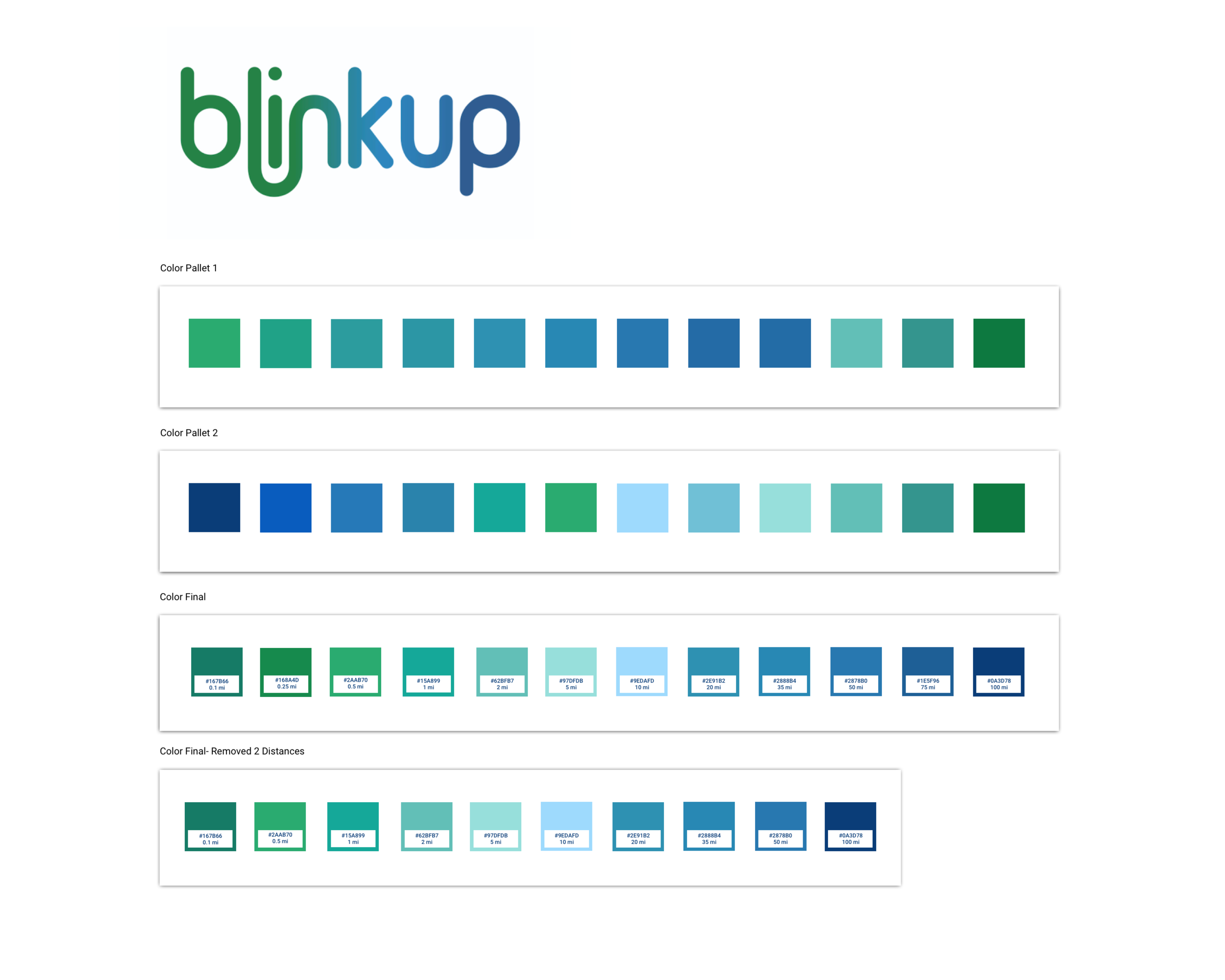
Color Studies: Each color corresponds with a radius distance
Hi-Fidelity Mockups: These include the brand colors, our logo and actual buttons/UI elements that can now be used for testing
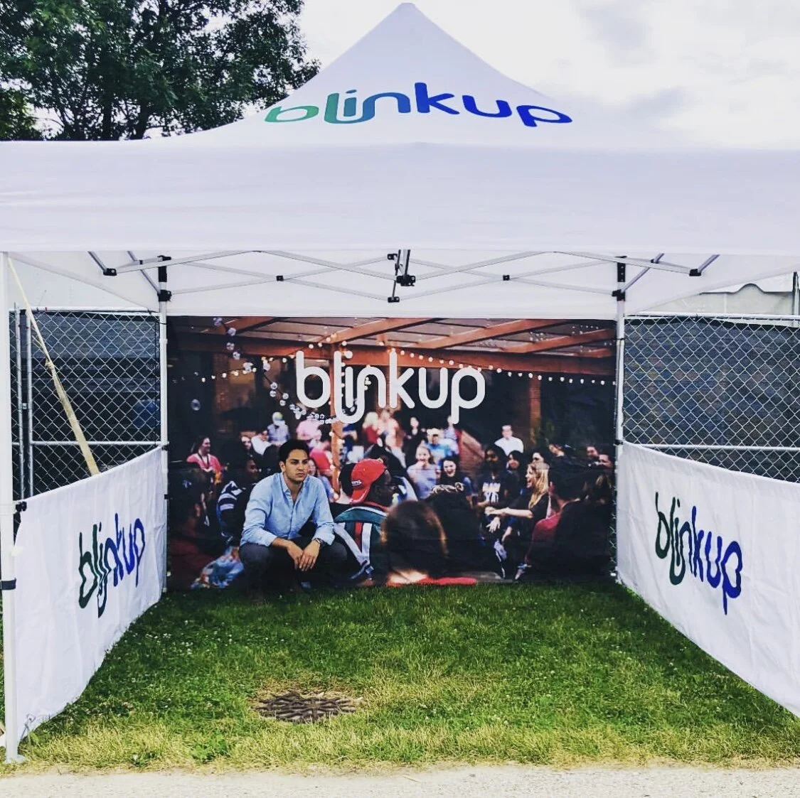
User Testing: Summerfest, Air and Water Show, Individual Sessions
Feedback Received:
Too much gray, the app didn’t look lively enough
Users were confused what to do on the home page - there didn’t seem like there was any direction or prompting
Navigation to add friends was a little bit confusing
Hi-Fidelity MVP Screens:
After user feedback: Gray buttons were changed to the color coordinating with its distance, Hamburger menu replaced with bottom nav bar, Multiple ways to add friends as well as invite them to locations to meet
A Closer Look
Check it out in the App Store!


